Why Is the Roblox Logo Blue? Understanding the Color Change and What It Means

Roblox has been part of my gaming life for years. The most recent change to its look happened quietly on February 21, 2025, when the app icon on my phone switched from black to a bright shade of blue. There was no clear announcement. To answer why the Roblox logo is blue, this article looks at the history of the logo, examines the psychology of the color, and considers what the change might signal for the platform.
Jump to:
Why Is the Roblox Logo Blue? A Quick Answer
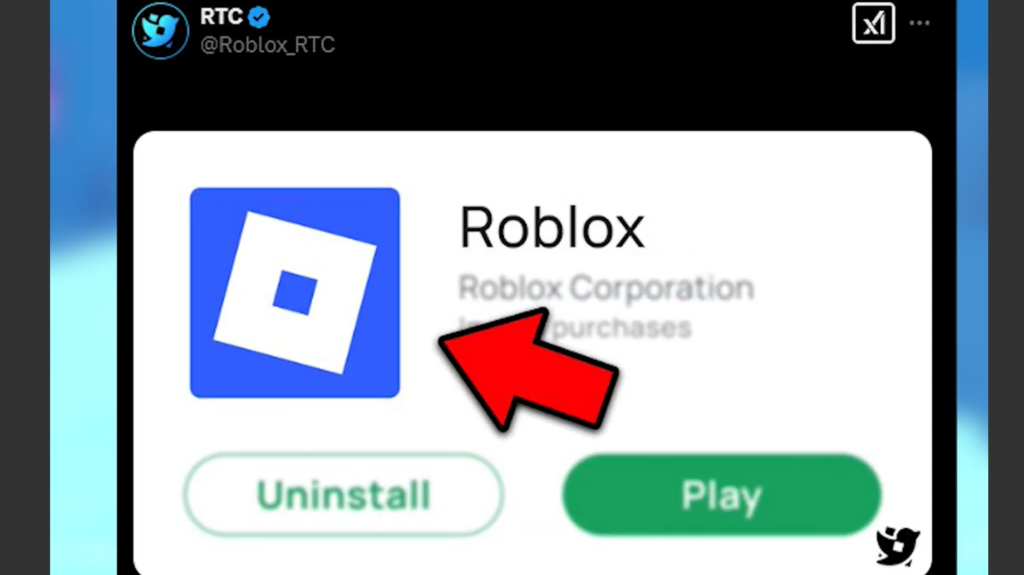
The Roblox logo turned blue when the company updated its icon in early 2025. Roblox hasn’t explained the choice, but blue is often linked with trust and reliability in design, making it common among technology and social media companies.
A calmer hue can help the platform appear more modern and welcoming. Some fans wondered whether the change was a tribute to late co‑founder Erik Cassel, yet there’s no evidence of a memorial connection. The most reasonable answer is that the company wanted a fresh, approachable look.
The Evolution of the Roblox Logo: From Multicolored Letters to Blue
In 2004 the word “Roblox” appeared in bright, playful colors. By 2015 the logo was a red wordmark. In 2017 the company introduced the now-familiar square icon with a tilted hole and paired it with a black wordmark. This design represented building and motion and signaled a shift toward a more serious brand. The wordmark was refined in 2022 with lighter letterforms.
The blue variant released in 2025 fits into this progression. It reintroduces color while keeping the iconic square and tilt. The move from a multicolored palette to a single cool tone mirrors Roblox’s growth from a hobbyist sandbox to a global platform. During this period the company also faced criticism over safety and moderation. Reports such as Roblox Has Been “an X Rated Hellscape” For Months show how negative headlines sometimes dominate the conversation. A calmer color may be part of a broader effort to reset the brand’s tone and reassure parents and partners.
Why Blue? Exploring the Psychology and Branding Behind the Color
Blue is one of the most trusted colors in branding. People often associate it with stability, security and calm, which is why many banks and tech companies use it. From my experience, a blue icon stands out clearly against light and dark backgrounds, which is an important factor on crowded screens.
Roblox likely chose blue to tap into these associations and to align its look with other technology platforms. A softer color can make parents feel more comfortable allowing their children to play. The hue also complements Roblox’s recent investments in sophisticated tools. The company has unveiled an AI-driven creation tool that generates 3D models from text prompts. Pairing a forward looking tool with a refined brand color suggests that Roblox wants to be viewed alongside major tech innovators.
Simplifying the palette also helps. Early logos used several colors and later versions were red or black. Adopting one dominant hue makes the brand easier to recognize across devices and separates it from the fan made games on the platform that use a riot of colors.
Community Reactions and Debates
Reactions to the blue logo have been mixed. Some players like the fresh look and say it makes the app feel polished. Others joke that the icon now resembles Facebook or Discord. During these discussions players repeatedly asked why is the Roblox logo blue and traded theories. Because Roblox offered no explanation, speculation filled the void, with rumors about tributes to developers or hints at future movies. Such rumors are common whenever the company changes its design or policies.
Debate about the logo often overlaps with concerns about moderation. Around the time of the update, Roblox announced new content descriptors for sensitive topics. An article about new sensitivity guidelines notes that the platform is adding labels for content related to politics, religion and other complex subjects. Some creators worry these changes could limit creative freedom. In that context a calm blue logo might be seen as part of an effort to project stability while the platform tightens its policies.
What the Blue Logo Means for Roblox’s Future
A new color alone doesn’t transform a platform, but it can hint at broader shifts. Roblox’s move to blue suggests a brand that wants to mature and align itself with established tech companies. The company now hosts virtual concerts, supports professional game development and partners with major entertainment franchises. In July 2025 Roblox introduced a new licensing platform that lets creators work with properties like Stranger Things. A unified, professional identity helps support these initiatives.
For players, the change is mostly cosmetic, but it hints at where Roblox is headed. A blue logo implies stability and a wider audience. Combined with investments in AI tools, stricter safety policies and new licensing options, the color change suggests Roblox is evolving into a more regulated and mainstream environment.
Final Thoughts on Roblox’s Blue Era
There is no official story behind the blue logo, but context provides clues. The shift fits a pattern of updates that reflect Roblox’s growth and its desire to be seen as a serious platform. Blue communicates calm and reliability, which could help rebuild trust after years of safety controversies.
Community responses have ranged from enthusiasm to skepticism, yet most players agree that the platform’s appeal lies in its games and social experiences. If you’re still wondering why is the Roblox logo blue, the answer may simply be that the company wanted to reset its look for a new era.
If you’re enjoying the evolving world of Roblox and want to customize your avatar or access premium content, snag a Roblox gift card. Buying a gift card from our store gives you a safe way to add Robux to your account and supports the games and creators you love. Whether the logo is blue, red or black, the magic of Roblox comes from the creativity of its community and the endless worlds waiting to be explored.
FAQs
Why is the Roblox logo blue?
The Roblox logo is blue because the company refreshed its brand in February 2025 and chose a single color associated with trust and modern technology. The new hue replaces the previous black icon and helps the logo stand out on screens.
Which developer’s death caused the Roblox logo to turn blue?
No developer’s death caused the Roblox logo to turn blue, despite rumors online. Speculation about a tribute to co‑founder Erik Cassel has circulated, but there is no evidence that the change is linked to any individual.
When did the Roblox logo change to blue?
The Roblox logo changed to blue on February 21, 2025, when the mobile favicon and app icon were updated. The rollout was gradual, so some users continued to see the older black logo for a while.
What color was the Roblox logo before it turned blue?
Before turning blue, the Roblox logo was primarily black and white, featuring a square with a tilted hole. Earlier versions of the logo included red wordmarks and colorful lettering during the platform’s early years.
Will the Roblox logo stay blue?
The Roblox logo will likely remain blue for several years, as brand updates are usually spaced apart. However, the company has a history of evolving its identity, so future revisions may adjust the shade or introduce new design elements.